
Aggression: Why All Imbalances Are Wrong
In the previous lesson, you learned how to see aggression as part of a potential reversal using the Price Rejector pattern. We were comparing bid and ask volume diagonally to see which is dominant.
The concept of “diagonal bid/ask imbalances” is very popular and widely taught.
It’s also of very little use! Let’s show you why…
Lesson recording
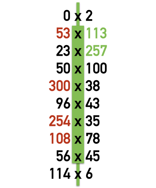
Footprint chart newbies (and not so newbies…) make a diagonal comparison of bid and ask volume. They’ll look at the percentage to determine if there’s a significant imbalance.
For example… a 300% buying imbalance means that 3 times as much volume lifted the offer as hit the bid. For a selling imbalance, 3 times as many contracts hit the bid as lifted the offer.
That’s exactly what’s pictured here. All of the price levels where there’s a 300% buying or selling imbalance are colored green or red to highlight the imbalance in buying or selling.
Sometimes traders will consider how many imbalances are in a bar; or if there are imbalances at consecutive price levels – a “stacked imbalance”.
The concept’s simple. It’s also totally flawed…
problem #1 - Pick a number... any number
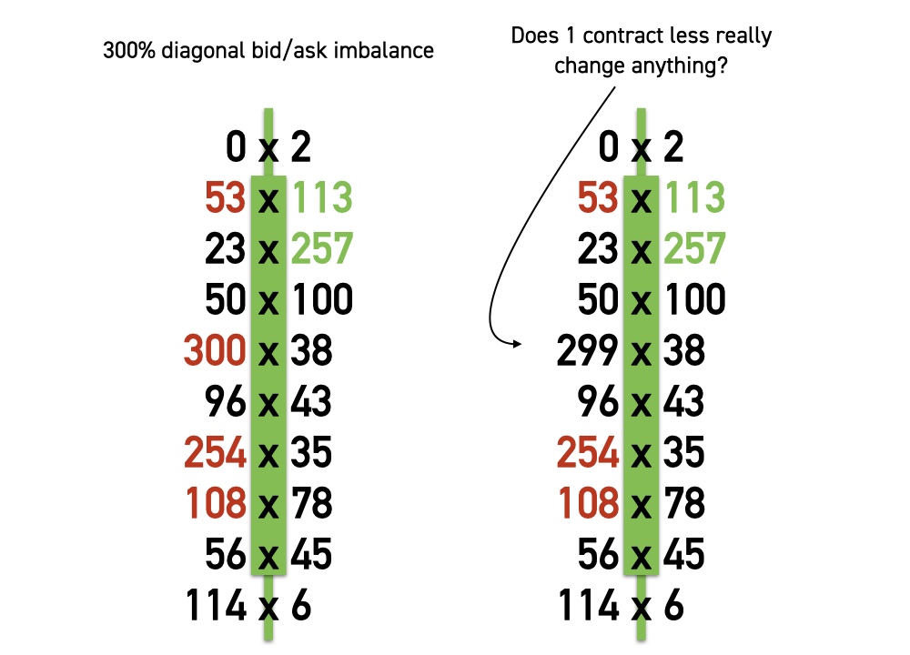
300% is arbitrary. Therefore it's wrong. Sometimes you'll hear about 300%, or 400% or 500% or 600% being the "industry standard". sometimes you'll see magic Fibonacci numbers used, e.g. 987% imbalance. Really?!? The fact that trees viewed from an airplane look like broccoli provides a significant number to use when comparing bid and ask volume??
Look at the 300% imbalance bar. Halfway down the bar there’s a 300% selling imbalance. 300 contracts hit the bid vs. 100 contracts lifting the offer.
What if only 299 contracts hit the bid? There would not be a 300% imbalance.
Does a single contract really make a difference to the selling aggression here?
We’ve said a few times now that all chart periods are arbitrary and therefore wrong. If you slice trading up into different buckets (bars!) of volume, the relationship between the volume will be different. You’ll see different imbalances appear on a 5 minute chart to a 10 range chart to a… whatever! It’s arbitrary and therefore wrong.
This same logic holds true if an arbitrary x-hundred percent imbalance is used as a filter to highlight “significant” aggression. How is 300 contracts vs. 100 contracts incredibly more significant than 299 contracts vs. 100 contracts? This is nonsensical.
What matters is that more volume has traded aggressively on one side of the market than the other in locations where it matters, i.e. Potential Inflection Points.
problem #2 - you're late
The next problem is most people that are looking at imbalances don’t know what to do with these arbitrary signs. Their thought process is:
“Look at all the aggressive buying in that bar… I should go long”.
What’s the problem with this? Let’s try this another way….
“Look at all the aggressive buying in that bar that has happened.”
If you are reacting to signs of aggression that have happened, you're late! You're buying after large buying has occurred.
The way to consider price levels that demonstrate aggression is to look for the reaction at this level if we revisit it. The aggression is a clue that there was supply or demand at this level. We don’t know if it remains there. Only if we return to that level will we know for sure.